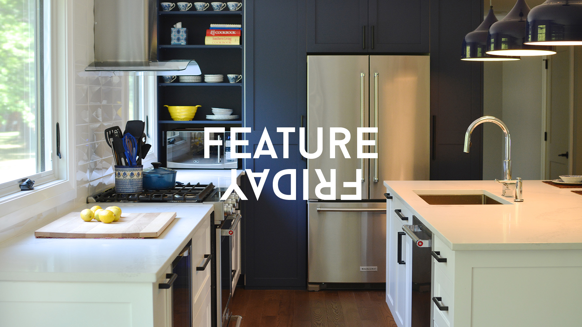
Feature Friday is back!
Welcome to 2017! We have a whole lot in store for you this year with more events, apparel, interviews, newspapers, photography, and highlighting the work you’re all doing to make Buffalo amazing.
We’re kicking off this year’s Feature Friday series by rounding up, once again, all of our favorite Instagrams of the week that were submitted using #RiseBFLO, but first, we’re excited to introduce you to our featured artist this week. Raelyn Woltz is an interior designer at Michael P. Design. She is also a lecturer at Buffalo State College in the Interior Design Department. (Check out her Instagram here.)
“Interior design is my passion. I love helping people convey their style and ideas into a functional space. Some of the clients that I work with have a general idea of what they want, but most are starting from square one and aren’t really sure of their style, or what they need.
“I find my approach to interior design different from other designers that I’ve seen in Buffalo because I’m focusing on more eclectic and modern interiors for the new wave of people coming and living in our city. Typically, Buffalo is behind on design trends and I want to change that. I’m pushing the Buffalo design envelope and moving people out of their comfort zones when it comes to their home. I really love working with different colors, textures, and patterns- whether boldly or subtly, to create an exciting space for the client to use and love. I tend to lean more towards clean and modern lines, but with a nod to vintage fixtures and furnishings. I find that the mix of the two create a really inviting environment.
Since most people have trouble visualizing their space, I love creating renderings and visual aids to really convey the ideas to them. Being able to see the space virtually helps myself and the client nail down details to set their space apart.
Transformation
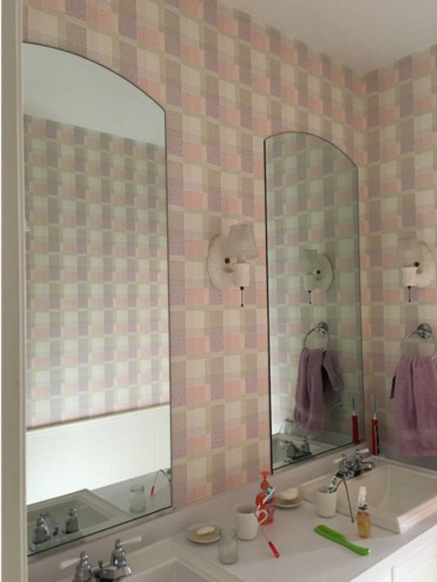
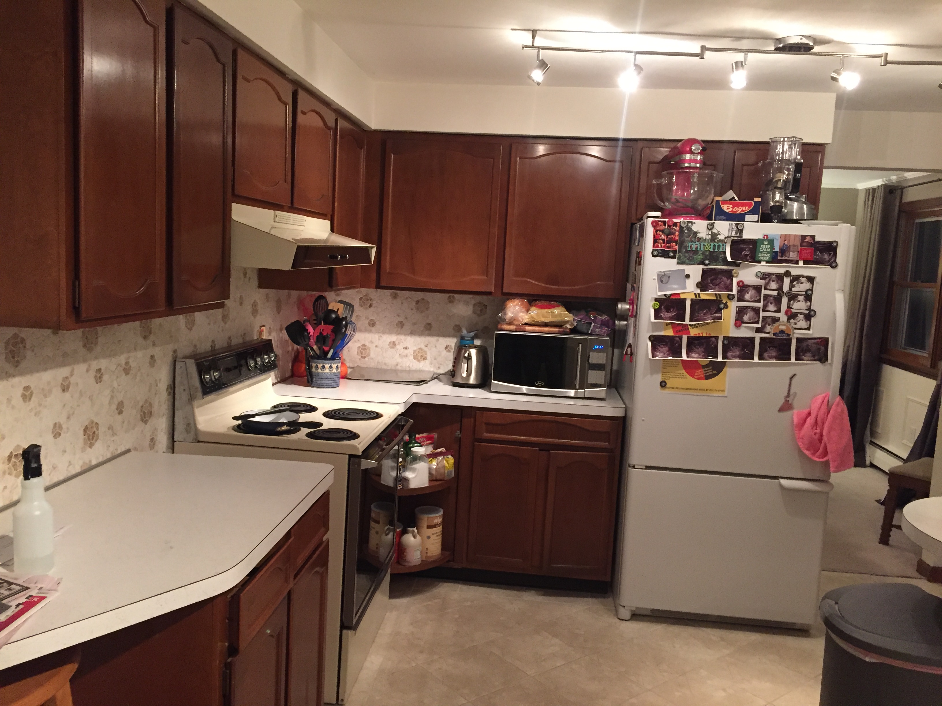
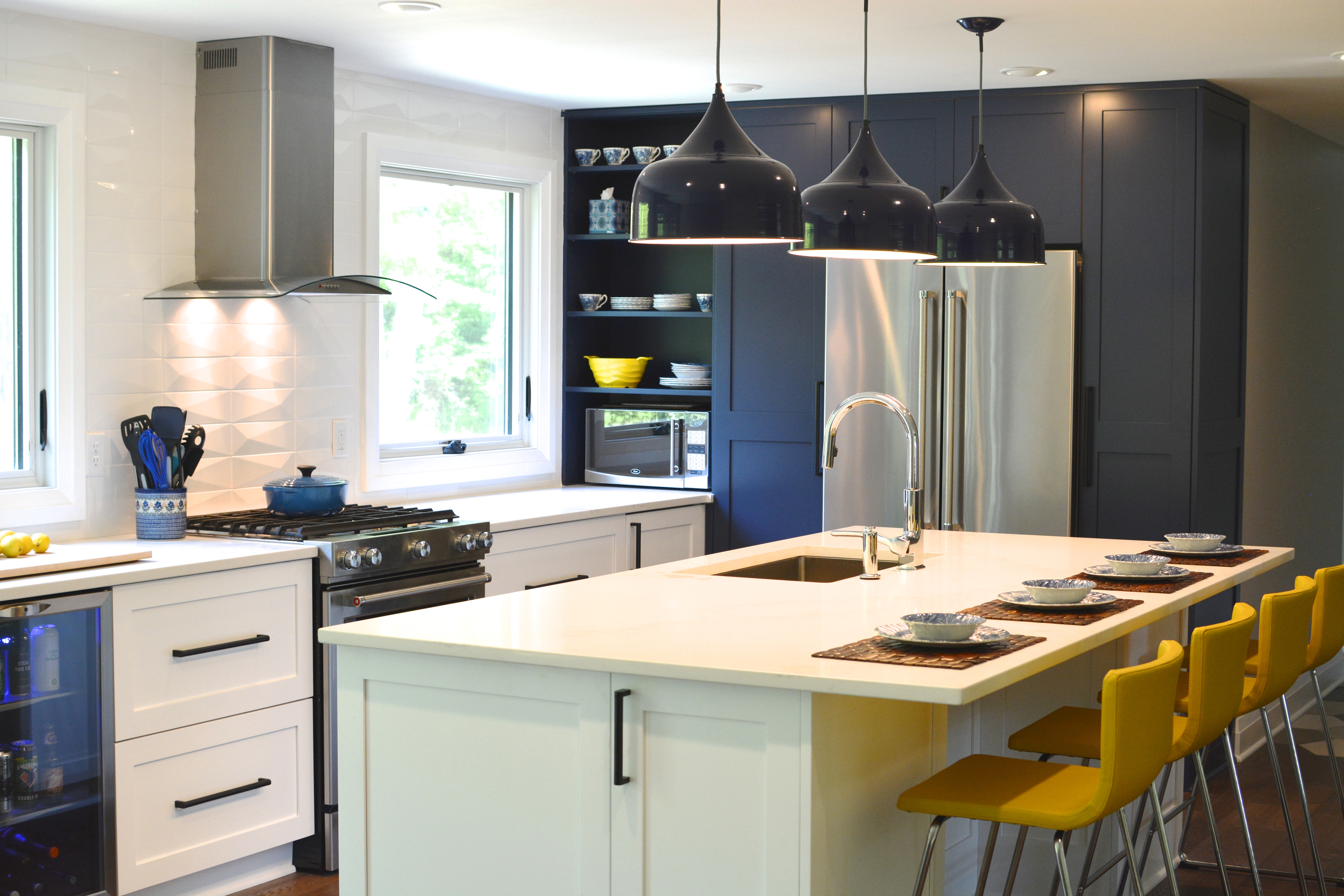
This project was on Grand Island. The couple had purchased a 1960s home that was very outdated with it’s finishes and layout. We completely revamped the entire first floor to fit their modern family needs.
BEFORE:
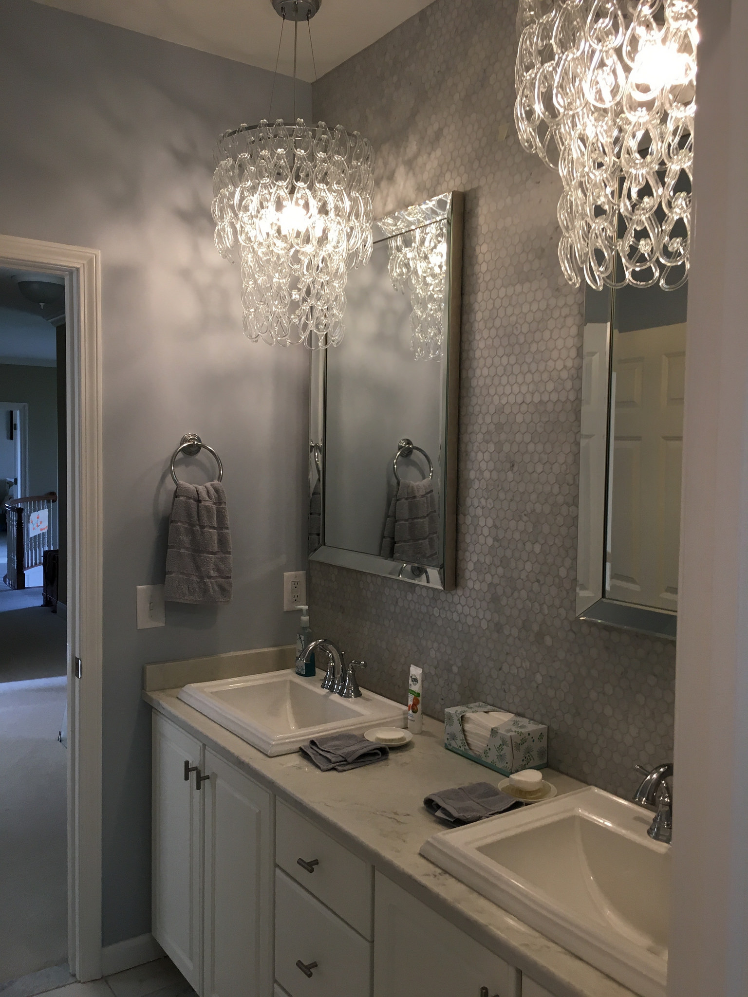
We were able to open up the space between the living room, dining room, and kitchen – but still made sure that each space felt like it’s own. The kitchen cabinets are ikea, but we opted to have the doors and finish panels made locally for a custom look. Instead of doing a typical two tone kitchen, where the island cabinets are one color and the perimeter is another, we decided to make the pantry wall a beautiful navy blue.
AFTER:
One of my favorite details was the floor transition between the wood in the kitchen, and the tile that made its way through the mudroom to the bathroom.
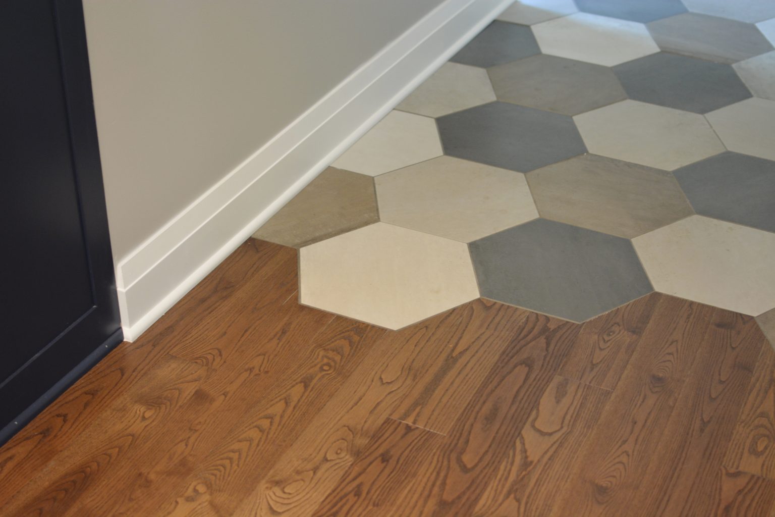
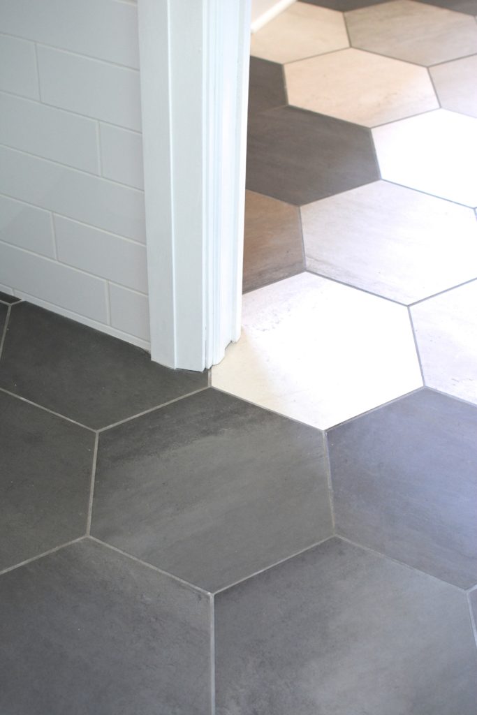
Pulling from her eclectic modern style, we were able to have some fun with the furnishings and finishes. The tile selections through out the house were my favorite part of this project, because they add a timeless beauty to each space.
Contact Raelyn!
If you’ve got a room or a whole house that needs a beautiful refresh, you can start with an email: raelyn.mwoltz@gmail.com
On to the best Instagrams of the week!
Prizes for the #1 ‘gram of the week will start again next Friday, so get out there and shoot!
A photo posted by Brittney Sikora (@bsikoraa) on
A photo posted by Chris Lombardi (@bloodandbravery) on
A photo posted by Greg Meadows (@_gmeadows) on
A photo posted by Britney (@bgodfrey730) on
A photo posted by jercooper (@jercooper) on
A photo posted by Megan Leary (@meganjleary) on